• print-friendly
  • Share


  • Home
  • Membership
    • Affiliates
  • News
    • Newsletters
    • e-news bulletins
  • Communities
    • DImensions
    • Discussion list
    • Guidelines
  • Better teaching
  • resolve
  • Library
    • Sample articles
    • TDT Readings
      • Fractions
      • Mental computation
      • Patterns
      • Reasoning
      • Statistics
    • Conference proceedings
    • Hanna Neumann lectures
    • Projects
      • Previous projects
    • Submissions
    • Media releases
    • Videos
      • Keynotes 2017
      • Keynotes 2015
      • Other videos
    • Other
  • Journals
    • Subscriptions
    • Submissions
    • Sample articles

    • Right menu

      View Basket View basket: 0 items

      Featured resource


      Home > Topdrawer > Statistics > Activities > Area in graphs

      Area in graphs

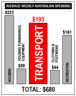
      This is one type of a misleading graph.

      Five bars of roughly correct relative height showing amounts $223, $59, $193, $44, $161. The $193 bar is twice as wide as others.

      Bar graph of average weekly Australian spending.

      Discussion points

      • What is the title of the graph?
      • What is being represented on the horizontal axis?
      • What is being represented vertically?
      • In a bar graph the area of a bar is proportional to the quantity represented in the bar, so how is this graph misleading?
      • What percentage of the weekly spending is spent on transport?
      • What percentage of the amount spent on transport would the area shown on the graph appear to represent?
      • Why do you think the reporter produced this plot?
      • Explain why we cannot find a median for this data set.

      Suggested answers for misleading area graphs can be downloaded.

      Year 6: Interpret secondary data presented in digital media and elsewhere

      Source


  • [home]
  • [copyright]
  • [disclaimer]
  • [privacy]
  • [sitemap]
  • [contact]
e news Twitter Facebook

©AAMT Inc.